Monday, May 13, 2019

Oracle SQL Developer Code Templates for APEX APIs

I recently added this repository on GitHub.

https://github.com/OraCoolAPEX/SQL-Developer-Code-Templates-APEX-APIs

If you use Oracle Application Express (APEX) API reference on SQL Developer, you may benefit from these code templates while working on a SQL Worksheet or PL/SQL Editor.

Preview


To Use It

  1. Use Ctrl + Space to manually activate the Completion Insight or check the automatic popup speed on Tools >> Preferences >> Code Editor >> Completion Insight
  2. To navigate through the parameters, use Tab to move forward or Shift + Tab to move backwards.
  3. Some parameters are pre-populated with their default values (if any) and others display their pre-defined possible values in /*comments*/.

To Configure It

  1. Download the CodeTemplate.xml that matches your current version of Oracle APEX (right now, only 18.2 is available).
  2. On Windows, navigate to C:\Users\<USER>\AppData\Roaming\SQL Developer:
    • If you do not have any previous Code Template defined, simply replace the existing CodeTemplate.xml file.
    • If you do have Code Templates defined, copy everything between the <rows></rows> tags on this CodeTemplate.xml file and paste it at the end of your existing file, right before the closing </rows> tag.
  3. Restart SQL Developer.

Troubleshooting

  1. Go to Tools >> Preferences >> Database >> SQL Editor Code Templates and make sure all the code templates are visible.
  2. Go to Tools >> Preferences >> Code Editor >> Completion Insight and make sure the following options are checked:
    • Enable Completion Auto-Popup in SQL Worksheet
    • Enable Completion Auto-Popup in PL/SQL Editor

Please feel free to provide any feedback or suggestions on how to improve or report any bugs in the comments below.

Monday, February 26, 2018

An Alternative to APEX_APPLICATION.HELP

If you are not familiar with the HELP function in the APEX_APPLICATION package, I'd recommend you first read about it in the APEX API Reference Documentation. The Example section provides the steps on how to implement this function in your application to display help information.

I tend to use this function in my projects since I like the idea of creating a reusable page to display help across the entire application. Unfortunately, it is limited to Page and Item(s) Help Text and, I find the parameters to customize the HTML output hard to work with.

I recently started working on a new project an decided to try a different approach. Instead of using the APEX_APPLICATION.HELP function, I'm querying the APEX Views to retrieve the metadata and using a Hero Region to display the page information and a Media List to display the items information.

I created a sample form using all the different item types and help text defined in the "Available Item Types" section on the APEX App Builder User's Guide to illustrate how the list looks like for each type of item:


As you can see, I'm using the same Page Designer icons to differentiate the Item Types, which provides additional visual information:


In case you are interested in doing something similar in your applications, below are the steps to accomplish this. Please let me know in the comments if you have any suggestions or feedback. And, as always, you can access my APEX Demo Application (Username/Password = Demo/Demo). Once you are in the Available Item Types page, click on "Help" on the upper right corner on the Navigation Bar List.

Finally, these are the steps (it assumes the Help page will be number 10):

  1. Create the Navigation Bar List entry with the Help link:
    • Go to Shared Components
    • Under Navigation, go to Navigation Bar List
    • Select the existing list, Desktop Navigation Bar
    • Click the Create Entry button
    • List Entry Label: Help
    • Page: 10
    • Set these items: P10_PAGE_ID
    • With these values: &APP_PAGE_ID.
  2. Create the dynamic Help list that queries the APEX view:
    • Go to Shared Components
    • Under Navigation, go to Lists
    • Click the Create button
    • Create List: From Scratch, Next
    • Name: Help List
    • Type: Dynamic, Next
    • SQL Query:
    • Click the Create button
  3. Create the modal Help page:
    • Go to the App Builder section in your application
    • Click on Create Page
    • Select a Page Type: Blank Page, Next
    • Page Number: 10
    • Name: Help
    • Page Mode: Modal Dialog, Next
    • Accept the defaults, then Finish
  4. Adjust the Help page properties:
    • Width: 800 (I found by not specifying a width, the report was overlapping the modal dialog window instead of wrapping the content.)
    • Under the CSS section, specify the File URLs: #IMAGE_PREFIX#apex_ui/css/core/IconFont.css?v=#APP_VERSION# (This IconFont.css is where the item types icons are defined.)
  5. Create the Hero Region that displays the Page Help:
    • Title: &P10_PAGE_NAME.
    • Type: PL/SQL Dynamic Content
    • PL/SQL Code: sys.htp.p(apex_escape.html_whitelist(:P10_PAGE_HELP_TEXT));
    • Template: Hero
    • Icon CSS Classes: fa-question-circle
    • Server-side Condition:
      • Type: Rows returned
      • SQL Query:
  6. Create the following Hidden Items under the Hero Region. Leave the defaults, including Value Protected = YES:
    • P10_PAGE_ID
    • P10_PAGE_NAME
      • Source Type: SQL Query (return single value)
      • SQL Query:
    • P10_PAGE_HELP_TEXT
      • Source Type: SQL Query (return single value)
      • SQL Query:
  7. Create the List Region that displays the Items' Help:
    • Title: Help
    • Type: List
    • List: Help List
    • Under Template Options:
      • Header: Hidden
    • Under Attributes:
      • List Template: Media List
      • Under Template Options, check Show Badges and Apply Theme Colors
And that's it!

Wednesday, November 22, 2017

DateDropper and TimeDropper APEX Item Plug-Ins

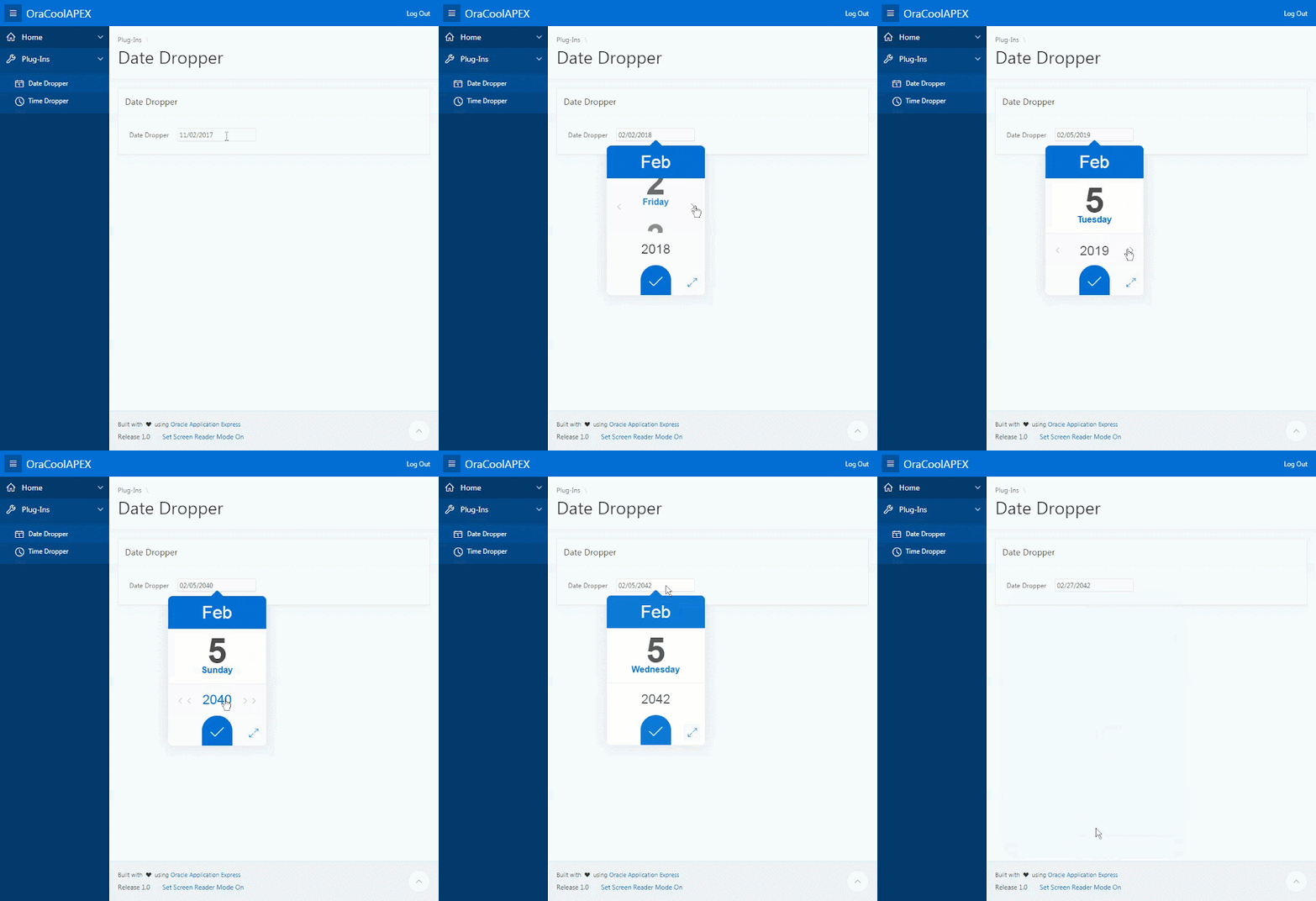
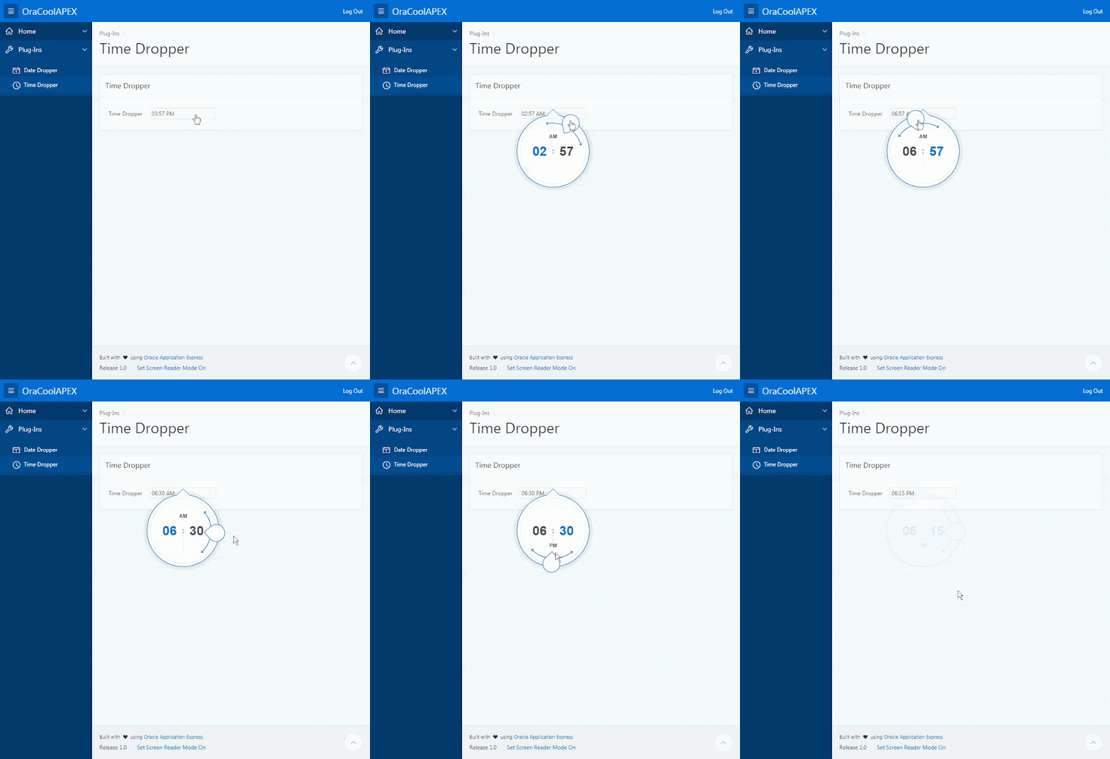
I recently created my first set of APEX item plug-ins based on two jQuery plugins created by Felice Gattuso (DateDropper and TimeDropper).

The plug-ins work well on both desktop and mobile and support multiple languages. I included a set of themes to match the color palette of the current APEX 5.1 themes such as Vita, Vita-Dark, Vita-Slate, and Vita-Red.

Below is a preview of the plug-ins:

DateDropper


TimeDropper


You can try them in my Demo APEX Application (DateDropper and TimeDropper).

To download them, you could either go to apex.world or clone them from my GitHub repositories (DateDropper and TimeDropper), where you can also review the documentation with all the available options.

This is a first release and there is still a lot of room for improvements (e.g. they currently do not work on Interactive Grid). Please feel free to report any issues you may find or contribute to the projects on GitHub.

Friday, September 22, 2017

Show/Hide Update Button Based on Page Change

APEX 5.1 introduced a new JavaScript namespace called apex.page with some interesting functions.

In this post, I will be using the isChanged function in a Dynamic Action to hide the Apply Changes button in an Employee Form and show it only after some of the information on the page has changed.

Below is a short video that shows the final product. Notice this works with any type of items:


To implement this, create a Dynamic Action with the following properties:
  1. Name: Show/Hide Apply Changes on Page Changed
  2. Event: Change
  3. Selection Type: JavaScript Expression
  4. JavaScript Expression: apex.gPageContext$
  5. Client-Side Condition Type: JavaScript Expression
  6. JavaScript Expression: apex.page.isChanged()
  7. True Action
    • Action: Show
    • Selection Type: Button
    • Button: SAVE
  8. False Action
    • Action: Hide
    • Selection Type: Button
    • Button: SAVE
That’s it! Feel free to login into my Demo Application to try this (Username/Password = Demo/Demo).

It’s possible to apply the same concept based on changes of specific items. The JavaScript apex.item namespace has a similar function and the way to call it would be:

apex.item(‘Px_ITEM_NAME’).isChanged();

Until next time.

Friday, May 26, 2017

Inspecting Oracle APEX Packaged Applications (Part 3)

This is the third and last part of a series of blog post. You can access the first and second parts here:

In this last part we are going to create a "Display As" pill button with two options using a List of Values with a custom template to switch between the Cards View created on the previous article and a new Interactive Report.
  1. Create a button under the new Movies Report region:
      • Button Name: ADD_MOVIE
      • Label: Add Movie
      • Button Position: Next
      • Hot: Yes
      • Under Template Options:
      • Spacing Left: Large
      • Action: Redirect to URL
      • URL: #0
  2. Go to Shared Components, List of Values:
      • Click on Create
      • Create List of Values: From Scratch
      • Name: DISPLAY_AS_LOV
      • Type: Static
      • Display Value #1: Cards View
      • Return Value #1: CARDS
      • Display Value #2: Report View
      • Return Value #2: REPORT
      • Create List of Values
  3. Edit the DISPLAY_AS_LOV list of values:
      • Edit the Cards View Display and add the following Template: <span class="t-Icon fa fa-cards" title="#DISPLAY_VALUE#"></span><span class="u-VisuallyHidden">#DISPLAY_VALUE#</span>
      • Edit the Report View and add the following Template: <span class="t-Icon fa fa-table" title="#DISPLAY_VALUE#"></span><span class="u-VisuallyHidden">#DISPLAY_VALUE#</span>
  4. Back on Page 4, create a sub region under the Movies Report region:
      • Title: Display As
      • Template: Blank with attributes
  5. Create a page item under the Display As sub region:
      • Name: P4_DISPLAY_AS
      • Type: Radio Group
      • Number of Columns: 2
      • Template: Hidden
      • Under Template Options:
        • Size: Large
        • Radio Group Display: Display as Pill Button
      • List of Values Type: Shared Component
      • List of Values: DISPLAY_AS_LOV
      • Display Extra Values: No
      • Display Null Value: No
      • Default Type: Static value
      • Static Value: CARDS
      • Escape special characters: No
  6. Create a new region:
      • Name: Report
      • Type: Interactive Report
      • SQL Query:
      • Page Items to Submit: P4_DISPLAY_AS
      • Under Template Options:
      • General: Show Maximize Button
      • Static ID: reportRegion
      • Custom Attributes: style="display: none;"
      • Region Display Selector: No
  7. Create a Dynamic Action:
      • Name: Toggle Display As
      • Event: Change
      • Selection Type: Item(s)
      • Item(s): P4_DISPLAY_AS
      • True Action #1:
        • Action: Execute JavaScript
        • Code:

That's it. Below are two print screens of the final result:


Thursday, May 25, 2017

Inspecting Oracle APEX Packaged Applications (Part 2)

This is the second part of a series of blog post. You can access the first and third parts here:

In this part we are going to implement a classic report using the cards template with a faceted search left side bar. In case you are wondering what a "faceted search" is, here is the definition according to Wikipedia:

Faceted search, also called faceted navigation or faceted browsing, is a technique for accessing information organized according to a faceted classification system, allowing users to explore a collection of information by applying multiple filters. A faceted classification system classifies each information element along multiple explicit dimensions, called facets, enabling the classifications to be accessed and ordered in multiple ways rather than in a single, pre-determined, taxonomic order.

Assuming we are working on Page Number 4.
  1. Modify the page properties:
      • Page Template: Left Side Column
  2. Create a new region:
      • Title: Cards
      • Type: Classic Report
      • SQL Query:
      • Page Items to Submit: P4_SEARCH,P4_ORDER_BY,P4_CATEGORIES,P4_DISPLAY_AS
      • Template: Blank with Attributes
      • Static ID: cardsRegion
      • Under the Report Attributes:
        • Template: Cards
        • Under Template Options:
          • General: Apply Theme Colors
          • Style: Basic
          • Icons: Display Initials
  3. Create a new region:
      • Title: Filter
      • Position: Left Column
      • Under Template Options:
        • Header: Hidden
        • Item Width: Stretch Form Fields
      • Static ID: filterRegion
  4. Create a page item under the Filter region:
      • Name: P4_SEARCH
      • Type: Text Field
      • Template: Hidden
      • Under Template Options:
        • Size: Large
      • Icon CSS Classes: fa-search
      • Value Placeholder: Search Movies
  5. Create another page item under the Filter region:
      • Name: P4_ORDER_BY
      • Type: Select List
      • Label: Order By
      • Template: Optional – Above
      • List of Values Type: Static Values
      • Static Values: STATIC2:Ascending;ASC,Descending;DESC
      • Display Extra Values: No
      • Null Display Value: - Select -
  6. Create another page item under the Filter region:
      • Name: P4_CATEGORIES
      • Type: Checkbox
      • Template: Optional – Above
      • List of Values Type: SQL Query
      • SQL Query: select category d, id r from categories order by category asc
      • Display Extra Values: No
      • Display Null Value: No
      • Pre Text:
  7. Create a region button under the Filter region:
      • Button Name: RESET_FILTERS
      • Label: Reset Filters
      • Button Position: Below Region
      • Button Template: Text with Icon
      • Under Template Options:
        • Type: Warning
        • Width: Stretch
      • Icon CSS Classes: fa-repeat
      • Action: Defined by Dynamic Action
  8. Create a dynamic action:
      • Name: Reset Search Filters
      • Event: Click
      • Selection Type: Button
      • Button: RESET_FILTERS
      • True Action #1:
        • Action: Clear
        • Selection Type: Item(s)
        • Item(s): P4_SEARCH,P4_ORDER_BY,P4_CATEGORIES
  9. Create a dynamic action:
      • Name: Refresh Report on Items Change
      • Event: Change
      • Selection Type: Item(s)
      • Item(s): P4_ORDER_BY,P4_CATEGORIES
      • True Action #1:
        • Action: Refresh
        • Selection Type: Region
        • Region: Cards
  10. Create a dynamic action:
      • Name: Refresh Report on Search Enter
      • Event: Key Down
      • Selection Type: Item(s)
      • Item(s): P4_SEARCH
      • Client-side Condition:
        • Type: JavaScript expression
        • JavaScript Expression: this.browserEvent.which === 13
      • True Action #1:
        • Action: Refresh
        • Selection Type: Region
        • Region: Cards
      • True Action #2:
        • Action: Cancel Event
        • Event: Refresh Report on Search Enter
That's it for this part. On the third and last part with are going to create a "Display As" pill button with two options to switch between the Cards View and an Interactive Report.

Wednesday, May 24, 2017

Inspecting Oracle APEX Packaged Applications (Part 1)

Oracle Application Express (APEX) provides a set of built-in Packaged Applications that you can install and use in your environment. There are two types of packaged applications: (1) Sample Applications that highlight certain APEX capabilities such as Charts, Dynamic Actions, and so on; and, (2) Productivity Applications that are fully supported by Oracle as long as you don't unlock them.

With every new release, the APEX Team put a lot of effort upgrading these applications to take advantage of new features introduced on that release. For that reason, every time Oracle releases a new APEX version, I like to spend some time exploring some of these built-in Packaged Applications looking for design and functional ideas that I can use in my own projects. Once I find something I like, it's very simple to inspect how they've done it (if it's one of the Productivity applications, it must be unlocked first before you can inspect it on the Page Designer).

For this article, I'll show the step-by-step on how to implement one design and functionality that caught my attention in the latest APEX 5.1, located on the Customer Tracker application, Page 59 - Customers.

Whether possible, I tried to use declarative methods, e.g. Dynamic Actions instead of writing pure JavaScript code, this way I keep things as simple as possible. This is the print screen of the page I'm referring to:


It has three features that I liked and I will explain each of them on separate posts due to the length of this implementation:
  1. Fixed Page Title with Icon and a Description.

  1. A Classic Report with Cards Template and a Faceted Search Left Side Bar.

  1. "Display As" Pill Button with Three Options: Cards View, Logo View, Report View.

I setup a demo application with the final results, login using the credentials Demo/Demo. You can also go there and copy the script to generate the sample database objects and data If you want to follow along this demo.

Let's start with the fixed page title with icon and a description.
  1. On your Application, create a new page:
    • Select a Page Type: Blank Page
    • Page Number: 4
    • Name: Movies
    • Breadcrumb: - don't use breadcrumbs on page -
  2. On Page 4, create a new region:
    • Title: Movies Report
    • Text: Track and Manage Movies
    • Position: Breadcrumb Bar
    • Template: Hero
    • Icon CSS Classes: fa-film
    • Region Display Selector: No
Optionally, you could use one of the images located on the following directory inside the APEX installation folder: apex\images\apex_ui\img\icons_src\pkg-apps, e.g.
  • Icon CSS Classes: app-script-planner

For this to work, you'll have to go to your application's Shared Components, User Interface Attributes. Select the Desktop interface, under Cascading Style Sheets add the following File URL:
#IMAGE_PREFIX#pkgapp_ui/css/5.0#MIN#.css

That's it for this part. On the second part with are going to create a classic report using the cards template with a faceted search left side bar.